Why everyone goes minimalistic
Peel chaos off the visuals:
why everyone goes minimalistic (and you should, too)?

Born in 1960s in Scandinavian household design workshops, the philosophy of minimalism took almost 50 years to take over the minds of designers from almost every nowadays’ industry. Once the possibility to have everything at once reached the limit of satiety, all of us came to realize, how often less means more. About the time iPhone 3G conquered the market of communication devices, the Apple-kind approach to design – smooth and rid of bells and whistles – became the new mainstream. In a blink of an eye tons of logos, leaflets, websites, labels stepped their first paces towards agile, minimalistic shapes and contents. Cosmetic industry, with all its labels, packaging and advertising followed this trend, too, of course.
Minimalism and raw materials
Minimalism is a trend, that’s meant to peel everything what’s unnecessary and non-informative off the labels. And not only labels. Even the approach to raw materials is coming through a transformation: the more minimalistic, the better. Plastic, the essence of industrial fashion through the last two generations, is flooding the entire planet. Luckily, we started to realize, that, left alone, this problem won’t solve itself and the ecology won’t lust much longer. It’s impossible to refuse from plastic packaging once and for good, but some alternative solutions are already pending. One of them is compostable (at least partly) polymers. It may seem too expensive, as for now, but the bigger and faster should demand for it grow, the faster will the price go down.
Another way is reducing consumption of raw materials. We already have bottled water brands who implement new generation of bottles containing up to 50% less plastic. Stride for stride go cosmetic packaging manufacturers, like Giflor with their Eco Low Profile collection. For countries with slower developing infrastructure of plastic waste recycling, eco-conscious brands pick up other alternatives, like shifting from polymer packaging to glass.
It’s not only plastic that can be cut on consumption. There are more and more examples of brands using peel-off labels in order to place more information on the primary packaging and get rid of cardboard secondary wrapping.
No excess for beauty
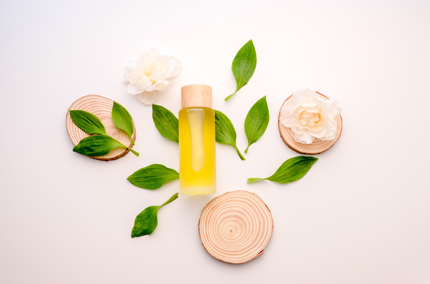
Packaging overloaded with text and graphics brings chaos to perception. The more triggers fight for our attention, the more we crave peace and quietness. Our aesthetical aspirations have long ago turned away from loads of glam. Gluts of visual attractions no more feel like abundance, but more like irritation. That’s why minimalism got commonly acknowledged so quickly. For cosmetics industry it means, that willing to place one’s products in the consumer’s bathroom for a longer time, it’s crucial for the brand to offer harmonic series of products adding visual order to the interior.
Minimum of content
“Minimum” stands for “just enough”. Rushing through longreads or decrypting carnivals of visual signs is not something we’d spend much time doing at store’s shelf. That’s why brands placing only the extract of useful information on the packing surface would always win. You can throw a Booker prize worth essay on the bottle – and it will be a waste of paper, ink and copywriting, because the consumer will only read the header and maybe one or two lines further. That’s all it takes a consumer to tell whether the product is worthy or not.
It doesn’t mean a label has to contain a logo and a one-line slogan. There’s no rule for that. The clue is, you have to use minimum words and symbols to claim the key advantages of the brand and the product, and not bother the consumer with overly-creative visuals and unnecessary information. Neat copy and smooth typographics will always win. What’s more, if you are a start-up brand and only have the access to simple standard packaging (that’s what retailers usually offer) – flaunt its simplicity. Simple is the new clever.
Minimum of shape
Minimalism roots much deeper than tiny logos on plain fields of labels. Two decades ago everyone just loaded the packaging (or any other content carrier) with all that ever came to mind. The trend of the last 7 or 8 years suggests picking up the pure essence of what’s crucial about the brand, the product and the client. That’s the mainstream of nowadays, and staying with this flow is a win-win strategy. There are much better ways to stand out rather than aggressive design and visual communication. Some choose vintage style, some dare to apply unconventional colors, some use images in branches dominated by text. All that is a matter of speaking one’s own unique language, and not trying to be the loudest barker in the market.
The main thing to avoid here is radical purism. Sure, a perfect design is one you can take nothing from, not the one you have nothing to add to. But that’s more about design as art, not as a tool. To make design work as a sales tool, a balance between creativity and the consumer’s needs is the real art.

